
Discriminatory ‘redlining’ increases climate risk in disadvantaged US neighbourhoods
Giuliana Viglione
05.17.24Giuliana Viglione
17.05.2024 | 10:00amLong-abolished discriminatory lending practices in the US are still having an impact on the inequality of climate risks facing urban populations today, according to a new study.
The research, published in Nature Cities, looks at historically “redlined” neighbourhoods – those deemed highly risky for lenders, broadly due to the race and economic profile of those in the area – and compares them to neighbourhoods that were seen as less risky.
The scientists find that, across more than 200 US cities, once-redlined neighbourhoods are at higher risk of heat exposure and flooding.
Even homes just tens of metres apart have different climate risks, they find, with those located on the redlined side of a boundary at higher risk than those living on the other side of the boundary.
The lead author of the study tells Carbon Brief that the work underscores the historical legacy of planning decisions made in the last century, adding that she hopes that current policymakers can better consider the “impact of different planning policies and the unintended consequences”.
One researcher who was not involved in the study tells Carbon Brief that the work makes several significant contributions, but cautions that the authors were “pretty bold” in some of their conclusions.
‘Risky’ investments
“Redlining” refers to a discriminatory historical practice in the US, whereby neighbourhoods were graded as too “risky” for investment based on race, income levels and housing quality. These grades were used as justification for the denial of long-term mortgages and exacerbated existing racial segregation.
One of the most recognisable remnants of redlining is the set of maps produced by the Home Owners’ Loan Corporation (HOLC), established in 1933 as part of US president Franklin D Roosevelt’s “New Deal”. The HOLC refinanced foreclosed mortgages at lower interest rates with the intention of preserving and expanding homeownership.
The HOLC created maps of “riskiness” of investment in an attempt to guarantee that the loans would be paid back and that the burden on the taxpayer would be minimal.
The maps created by the HOLC classified neighbourhoods based on a four-point risk scale, with A-grades – the “best”, or least-risky, investments – outlined in green and D-grades – the most risky, termed “hazardous” – outlined in red, giving rise to the term.
B-graded neighbourhoods, outlined in blue, were termed “still desirable”, while C-graded ones, in yellow, were “declining”.
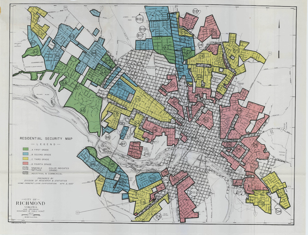
The HOLC created maps for more than 200 cities across at least 40 states. Other federal agencies and private companies later made their own “risk-assessment” maps, further cementing the practice into policy.
Although redlining was formally outlawed in 1968 by the US Fair Housing Act, the inequalities created and exacerbated by the practice persist in many places to this day, says Dr Arianna Salazar-Miranda, an urban planner and data scientist at Yale University.
Salazar-Miranda, who is the lead author of the new study, tells Carbon Brief:
“There are many social and economic dimensions for which we should be worried about this long-standing legacy of redlining.”
For example, previous research has shown that redlined neighbourhoods have lower rates of homeownership, lower credit scores and lower home values. There are also associations between historically redlined neighbourhoods and prevalence of cancer and asthma, air pollution and proximity to hazardous waste, among other dimensions of health inequality and environmental racism.
Prof Shannon Van Zandt, an urban planner at Texas A&M University, who was a reviewer of the new paper, but not involved in the study itself, tells Carbon Brief:
“Segregation is still so relevant in the experiences of families of colour and, in particular, Black or African American households, because of the very indelible lines that we literally drew [on the map].”
Climate risk
Using maps from 202 cities across the US, Salazar-Miranda and her colleagues examine the risk of heat extremes and flooding for homes in differently graded neighbourhoods. These factors, each graded on a 1-10 scale from least to most hazardous, were developed by the climate research and technology firm First Street.
The heat risk factor combines temperature and humidity to determine a “feels-like” temperature, averaged across the month of July for each location.
The flood risk factor uses flooding factors, such as rainfall and high tide levels, as well as variables that affect water runoff, including elevation and ground permeability. It also incorporates existing community flood defences. The risk is defined by both depth and likelihood of flooding.
Both the heat and flood risk scores also factor in projections of future climate change, including higher temperatures and sea level rise.
The researchers focused specifically on homes within 100 metres of a boundary between two different grades. Salazar-Miranda tells Carbon Brief:
“We’re trying to narrow down on a subset of properties that are very comparable, where they have the same underlying conditions and the only thing that changed is whether they’re on one side of the border or the other.”
The maps below show the digitised redlining map of Baltimore (left), with the colours indicating the different grades and the bold lines depicting boundaries between different grades.
On the right, a zoomed-in portion of the map shows the 100-metre buffer zones drawn around each boundary. Locations of houses are coloured according to which side of the border they fall on – grey for the lower-graded side and black for the higher-graded side.
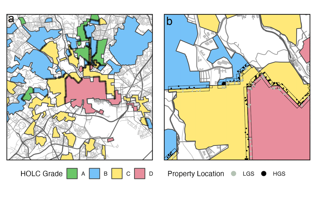
Geographical and climatic features, such as elevation and amount of rainfall, did not vary significantly across the boundaries because the researchers were only looking at homes close to a grade boundary.
They find that, aggregated across all cities, D-graded neighbourhoods have a flood risk factor that is 0.245 points higher than A-graded ones – more than three times higher than the additional risk of a C-graded neighbourhood.
The heat risk effect is smaller, but still significant, with D-graded neighbourhoods scoring 0.033 points higher than A-graded neighbourhoods.
The chart below shows the flood and heat exposure risks for neighbourhoods graded B, C and D, relative to the average risk for A-graded neighbourhoods. While both risk factors increase as the grade decreases, the effect is much more pronounced for flood risk.
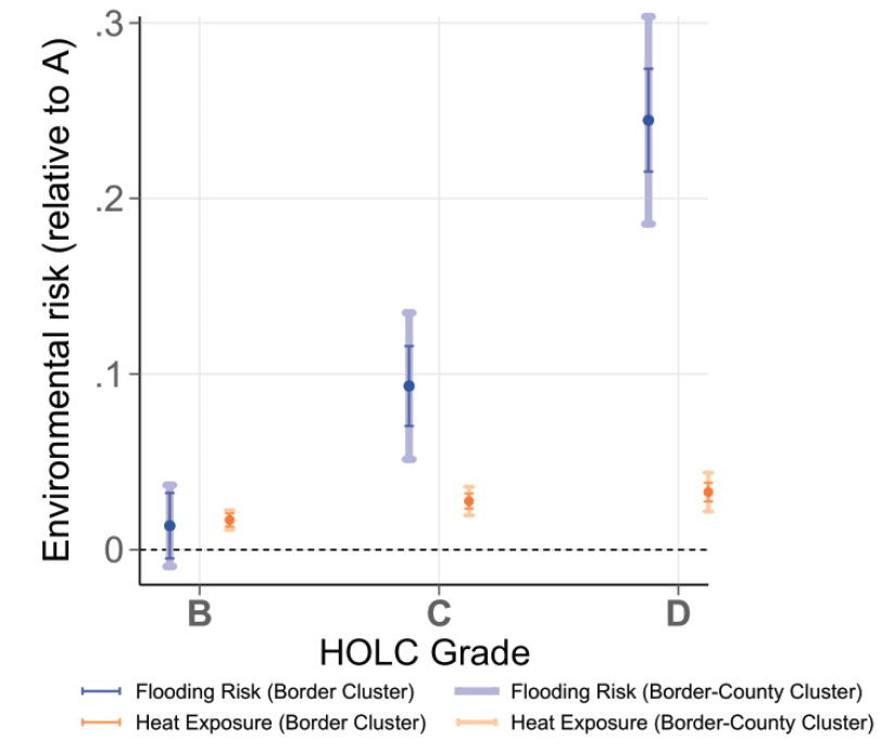
They also find that flood risk factor increases by 0.1 points, or about 5.5% on average, for homes that are on the lower-graded side of a border, as compared to homes on the higher-graded sides. For the heat risk factor, this figure is 0.011 points.
Although the absolute change in the heat risk factor is relatively small, Salazar-Miranda tells Carbon Brief that these “very small changes…can really harm your health”. She adds:
“It really depends on your pre-determinants of health – how healthy you are, how well you eat, whether you have diabetes or an underlying health condition. And we know that these are particularly worse in disadvantaged communities.”
Doing the analysis on a parcel-scale – namely, house-by-house – is one of the most significant contributions of the new work, says Prof Vivek Shandas, a professor of geography focusing on urban climate at Portland State University in Oregon, who was not involved in the new research. However, Shandas adds:
“There’s a lot that happens across 200 or 100 metres in a city…If we’re doing parcel-scale assessments, we need to get parcel-scale understanding of movement of water and the way that heat is distributed.”
‘Environmental capital’
The researchers then investigate a potential mechanism for how historical redlining could still be impacting vulnerability to current and future climate risks.
They propose that lower-graded neighbourhoods had less investment in what they call “environmental capital”, such as trees, public parks and drainage systems.
This, they say, could be due to a combination of factors: lower property values in the neighbourhoods reduces the communities’ tax income that could be invested in such projects; places with high levels of income inequality tend to have lower community engagement; and low homeownership rates can lead to reduced community investment in public goods, such as parks.
As a proxy for environmental capital investment, the authors look at four measurable factors of environmental quality: tree canopy, street-level vegetation, ground-surface perviousness and home foundation height. Tree cover and street-level vegetation can both mitigate heat risk by providing shade and inducing a cooling effect. More pervious ground surfaces allow more drainage, while higher foundations can decrease an individual home’s risk of flooding.
They find that for each measure of environmental quality, lower-graded neighbourhoods score progressively worse than higher-graded ones, as seen in the chart below.
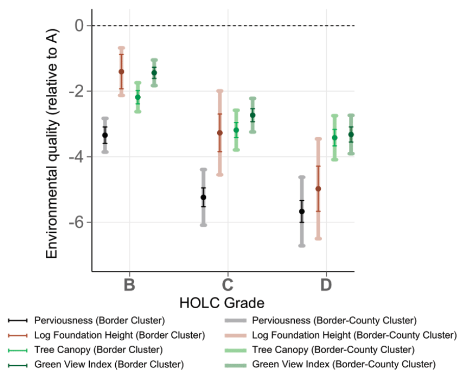
Houses in D-graded neighbourhoods are, on average, nearly 5.7 percentage points less pervious and have 3.4 percentage points less tree cover than those in A-graded areas.
Similarly, homes on the lower-graded side of a border have lower perviousness and foundations closer to the ground level than homes on the higher-graded side, by 1.9 and 2 percentage points, respectively. Tree canopy and street-level vegetation differ between the two by 1.03 and 1.2 percentage points.
Shandas tells Carbon Brief that introducing the idea of capital into this type of analysis is “really interesting”, but the claims the authors make about their proposed mechanism are “pretty bold”. He adds:
“Each city is so unique…We can find an association, but getting a mechanism has to be [on] a case-by-case basis.”
Van Zandt adds that the redlined maps are a “good proxy”, but not necessarily the driver of inequity. The important part, she says, is “that we identified neighbourhoods that banks should not invest in – and that those patterns persist to today”.
Lived experience
Given the disparities identified in the work, Salazar-Miranda says she hopes that policymakers can incorporate this type of information into funding and other policy decisions. As an added benefit, she says, many of the investments in environmental capital – such as additional green spaces – can improve mental and physical well-being. She adds:
“One of the conversations that would be interesting, from a policy point of view, is how do we bring the types of resources to these communities that can be helpful in mitigating these environmental risks, but also from a social point of view.”
While the findings themselves are not surprising, “it’s great to have systematic assessments” and scientific evidence to back up people’s firsthand knowledge, Shandas says. He tells Carbon Brief:
“Historically disinvested parts of cities tend to be at the frontline of extreme climate events – including flooding and heat. I know the communities that live in the cities that I [have worked with] regularly have brought this up for many, many years.
“The most significant part of this study is that it’s corroborating what the lived experiences of communities have been for quite some time.”
Van Zandt adds:
“It’s not a historical study. It’s a study of what’s happening today and what’s going to continue to happen in the future.”


Salazar-Miranda, A. et al. (2024) Long-term effects of redlining on climate risk exposure, Nature Cities, doi:10.1038/s44284-024-00076-y
-
Discriminatory ‘redlining’ increases climate risk in disadvantaged US neighbourhoods